

Product Photography
Minimalist Luxury Product Photography
A reusable image-generation prompt for polished, unbranded luxury product photography across beauty, e-commerce, and branding campaigns.
Featured real result
What this prompt produced
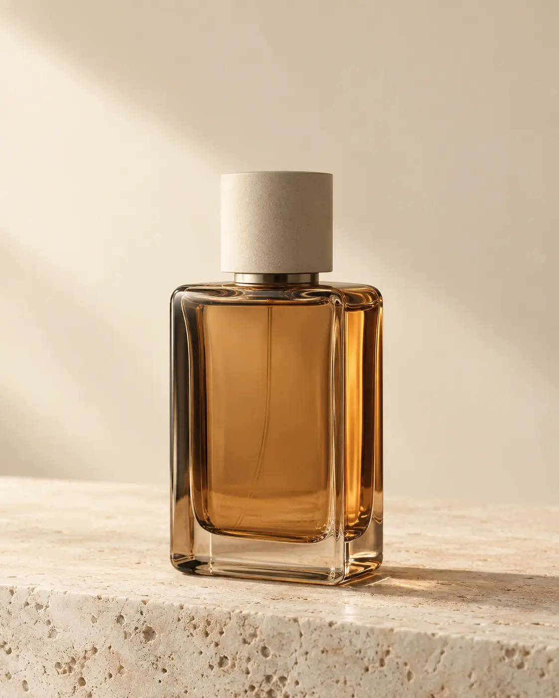
The bottle remains the clear hero with controlled warm reflections and a clean premium surface.
The master prompt
Create a high-end commercial product photograph of [PRODUCT] for beauty advertising, e-commerce campaign imagery, premium social media content, and branding reference. Use these variables: [PRODUCT], [BOTTLE COLOR], [BACKGROUND COLOR], [ACCENT MATERIAL], [LIGHTING MOOD]. Show one original, unbranded luxury product container with a refined silhouette, softly rounded edges, premium material detail, a minimal cap or closure where appropriate, and no recognizable brand design. Place it upright as the clear hero subject on [ACCENT MATERIAL], framed in a clean vertical 4:5 composition at a slight three-quarter camera angle, with generous negative space and a premium editorial balance. Use realistic studio product photography, [LIGHTING MOOD], controlled highlights on the product surface, subtle grounded shadow, restrained reflections, a polished commercial finish, crisp product focus, natural material detail, and photorealistic rendering. Keep the background seamless, quiet, and uncluttered in [BACKGROUND COLOR]. No logos, no brand names, no trademarked design, no extra products, no flowers, no hands, no people, no busy props, no distorted materials, no warped geometry, no illegible dominant text, no watermark. Final image aspect ratio 4:5.
Visual direction
Style: Minimalist, premium, elegant, realistic studio product photography with a polished commercial finish.
Lighting: The declared lighting mood controls the variation while preserving controlled highlights, subtle grounded shadows, and restrained reflections.
Composition: One upright product as the hero subject on the declared accent material, slight three-quarter camera angle, generous negative space, and a vertical 4:5 frame.
Variables
- PRODUCT — the generic product or container
- BOTTLE COLOR — the product material or color
- BACKGROUND COLOR — the seamless backdrop tone
- ACCENT MATERIAL — the surface or supporting material
- LIGHTING MOOD — the desired light direction and atmosphere
How to use it
- Replace all five variables with one coherent product configuration.
- Keep the master prompt structure unchanged when comparing variations.
- Generate at 4:5, then inspect product geometry, reflections, negative space, and commercial suitability.
Same master prompt, different variables
Demo variations
Demo 01
amber glass perfume bottle
- BOTTLE COLOR
- warm amber glass
- BACKGROUND COLOR
- warm ivory
- ACCENT MATERIAL
- pale travertine stone
- LIGHTING MOOD
- soft directional morning studio light
The bottle remains the clear hero with controlled warm reflections and a clean premium surface.
Demo 02
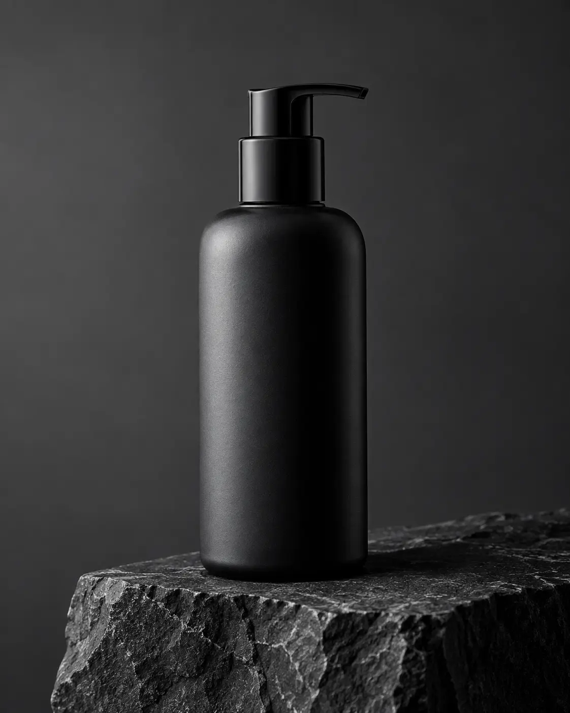
matte black skincare pump bottle
- BOTTLE COLOR
- matte black
- BACKGROUND COLOR
- soft charcoal gray
- ACCENT MATERIAL
- dark basalt stone
- LIGHTING MOOD
- controlled soft side light
The darker material still preserves the single-product composition, readable silhouette, and understated commercial finish.
Demo 03
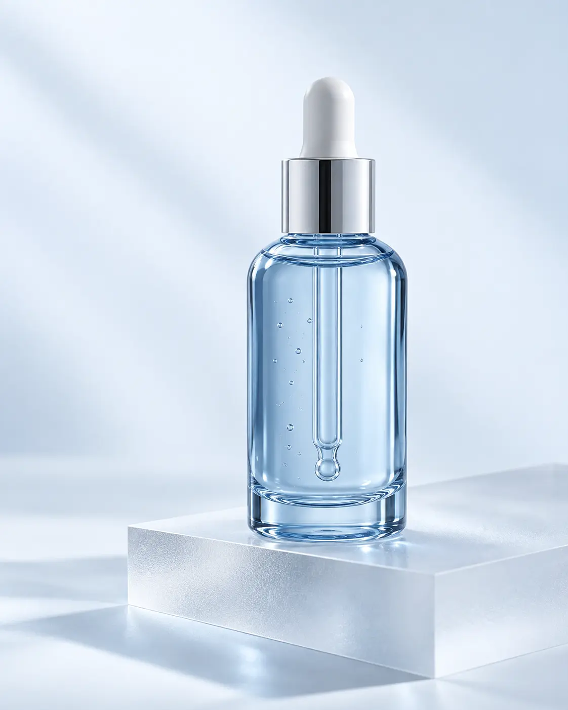
clear blue glass serum bottle
- BOTTLE COLOR
- translucent pale blue glass
- BACKGROUND COLOR
- cool white with a faint blue cast
- ACCENT MATERIAL
- frosted acrylic slab
- LIGHTING MOOD
- cool diffused studio light
The transparent bottle introduces more reflective variation while keeping the background quiet and the product dominant.
Demo 04
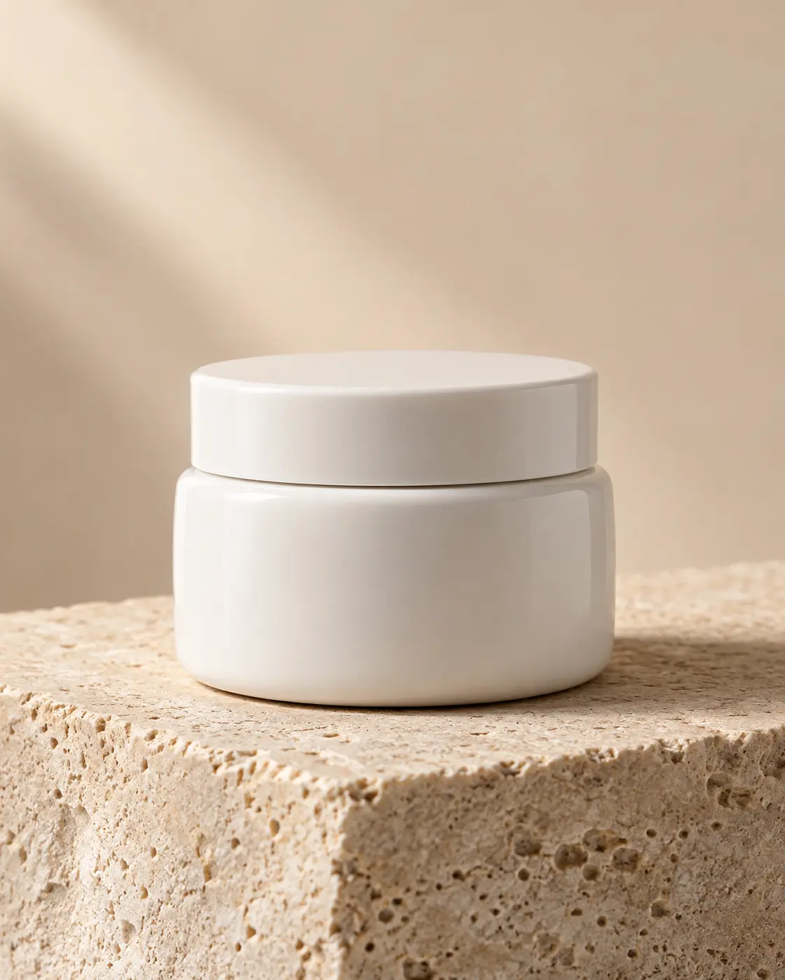
minimal white ceramic cosmetic jar
- BOTTLE COLOR
- soft white ceramic
- BACKGROUND COLOR
- warm beige
- ACCENT MATERIAL
- natural limestone
- LIGHTING MOOD
- soft daylight-inspired studio light
The ceramic jar shows the prompt can carry the same premium structure beyond bottles, with softer highlights and stable geometry.
Consistency / testing notes
Product focusCONSISTENT
Each image presents one clear central product as the dominant subject.
Minimal premium languageCONSISTENT
All four retain quiet backgrounds, restrained styling, and commercial product-photography framing.
Composition and negative spaceMOSTLY CONSISTENT
The common upright three-quarter structure holds, while the ceramic jar fills more of its frame.
Lighting direction and shadowMOSTLY CONSISTENT
Soft directional light and grounded shadows persist, but the cool blue demo is more diffused.
Product geometryMOSTLY CONSISTENT
All products are recognizable and usable, with expected variation in transparent and ceramic forms.
Text and brand avoidanceCONSISTENT
No logos, brand names, or distracting dominant packaging text appear.
Reflective materialsMOSTLY CONSISTENT
Glass and acrylic reflections vary more than matte and ceramic surfaces, as expected.
All four demos use final master prompt version v2-four-demo-product-photography; only declared variable values changed. Four authentic generations were assessed as one set.
Tips for better results
- Pair the accent material with the lighting mood so reflections remain intentional.
- Use one hero object and a quiet surface to preserve product focus.
- Add packaging text only through a controlled post-production step if exact lettering is required.
Limitations
- Text printed on generated packaging may be inconsistent or illegible.
- Reflective glass and exact product geometry can vary between generations.
- Different image models may interpret lighting and material reflections differently.
- Review final imagery for commercial suitability before use.