

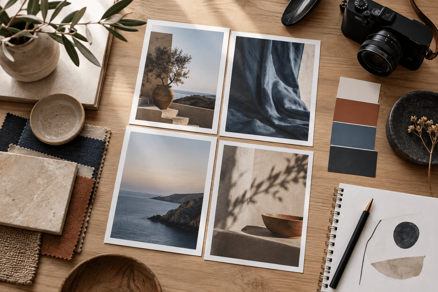
A visual reference board is a decision-making tool. It does not ask an image model to copy a collage literally; it helps the person writing the prompt understand the direction before turning that direction into language.
The strongest boards are selective. They make mood, material, color, light, composition, and level of detail easier to discuss. A crowded board with unrelated references may look energetic, but it gives the prompt too many competing instructions and makes the final result harder to evaluate.
1. What a reference board does
A board aligns a visual goal before production begins. It can answer questions that adjectives often leave vague: Is the image quiet or theatrical? Are materials matte or glossy? Should the camera feel close and human or distant and architectural? Is the palette warm, cool, restrained, or intentionally contrasty?
It also separates inspiration from instruction. A reference may contribute its lighting, another its material, and another its framing. The board is not a promise to reproduce any one source. It is a place to identify the qualities the final prompt should make explicit.
For Prompt Harend-style testing, the board can also define what stays stable across demos. If the aim is consistent product readability, choose references that clarify silhouette and light rather than only showing a beautiful atmosphere.
2. Select useful references
Begin with a small set of references that answer different questions. One image can establish composition, one can clarify lighting, one can show material behavior, and a color or texture sample can support the palette. Four to eight focused references are often easier to interpret than a large wall of images.
Choose references for the decision they support:
- Composition reference: where the subject sits, how much space surrounds it, and how the eye travels.
- Lighting reference: direction, softness, contrast, and shadow behavior.
- Material reference: how ceramic, metal, fabric, skin, paper, or glass should read.
- Color reference: the relationship between dominant, supporting, and accent colors.
- Detail reference: the amount of texture or visual information appropriate to the use case.
Do not select a reference only because it is attractive. Ask whether its useful quality can be described and tested. If you cannot say what the image contributes, it may be visual noise.
3. Organize by decision
Group the board by the decision each reference supports instead of placing everything in one undifferentiated collage. A small label or note can say “light direction,” “surface,” “framing,” or “palette.” The note does not need to become part of the generated image; it helps the writer convert the board into a structured brief.
Keep the subject separate from the atmosphere. A reference may show a beautiful interior, but the prompt may only need its warm window light and pale drafting surface. Separating those qualities prevents an entire unrelated scene from being imported by accident.
Look for repeated signals. If three references use a soft side light and restrained indigo accent, that repetition may be more important than a single dramatic image with a different mood. Repetition helps identify the stable direction.
4. Translate references into words
Once the board is focused, write observations rather than naming sources. Replace “make it like this image” with “soft directional daylight from camera left, low contrast, pale matte surface, controlled grounded shadow.” That sentence is clearer, more adaptable, and easier to evaluate.
Translate the board in the same order as the prompt: subject, action or state, setting, composition, lighting, materials, palette, and output intent. Keep subjective words only when they are supported by a visible quality. “Editorial” might mean restrained styling, deliberate negative space, and a clear focal hierarchy; state those qualities.
Use variables where the board shows options. [SURFACE], [SETTING], and [PALETTE] can change between demos while the composition and subject-protection instructions remain stable.
5. Avoid conflicting signals
Every reference adds a signal. A dark cinematic portrait, a bright catalog product shot, and a playful maximalist still life may each be useful alone, but together they need a hierarchy. Decide which quality leads when the model has to choose.
Watch for contradictions in scale, light, and texture. A soft low-contrast palette paired with hard spotlighting may create an interesting result, but it should be an intentional experiment rather than an accidental collision. A minimal composition paired with many detailed props can also undermine the visual job.
Remove references that no longer help. Editing the board is not losing creativity; it is protecting the clarity of the brief. A focused board gives the model fewer competing interpretations and gives the reviewer a more understandable target.
6. Use the board in a workflow
Keep the board at the planning stage, then write a final master prompt from its observations. Test that prompt through several controlled variations. The reference board is not proof that the generated images will match the references, and the generated images should not be presented as reproductions of the source material.
Compare the demos against the decisions the board was meant to support: is the subject clear, is the light believable, are the materials distinct, and does the palette remain useful? Record limitations instead of hiding them. AI systems vary in interpretation, and exact text, logos, likeness, and product geometry may require separate production methods and review.
This process connects to the consistency testing guide and the broader prompting framework. The board helps define the direction; the prompt makes the decisions operational; the demos show what held up.