

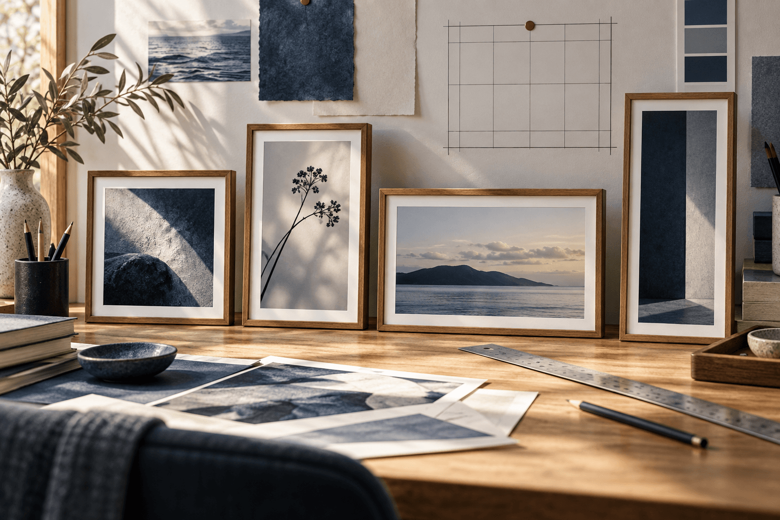
A product image has a basic responsibility: the viewer should be able to understand what the object is. Style can make the image memorable, but it should not bury the silhouette, materials, controls, or relationship between parts that make the product meaningful.
AI image generation is useful for exploring product directions, editorial scenes, and presentation ideas. It is also prone to changing geometry, inventing details, or turning a functional object into a generic prop. A careful prompt cannot guarantee perfect product fidelity, but it can make the visual goal clearer and the failures easier to inspect.
1. Start with a product brief
Name the object in practical language before describing the mood. “An unbranded ceramic pour-over coffee maker” tells the model more than “a beautiful premium object.” Then state the visual job: a clean three-quarter product view, a detail study of the material, or an editorial still life with enough negative space for copy.
Define what must remain recognizable:
- the overall silhouette and proportions;
- distinctive functional parts such as handles, controls, lids, or fasteners;
- the relationship between the object and its supporting surface;
- the viewpoint and visible side that best explains the product.
Keep the product central even when the setting is expressive. A kitchen, studio, workshop, or listening room can add context, but the environment should not turn the image into a generic lifestyle scene where the object becomes hard to identify.
2. Describe material and construction
Material words work best when they connect to visible behavior. Ceramic can be matte, glazed, translucent at the edge, or slightly irregular. Brushed metal can show directional grain and controlled highlights. Clear glass can carry reflections and refractions, but it may also disappear against a busy background.
Describe the relationship between surfaces instead of listing every adjective. “A matte ceramic body with a warm wood handle and small brushed-metal controls” gives the model a hierarchy. Then explain what should remain distinct: “Keep the materials separated by clean edges and believable contact shadows.”
Avoid instructions that contradict the surface. A rough, mirror-like, soft, and perfectly uniform object is difficult to interpret. Decide which quality is primary and let the light support it.
3. Use light to reveal form
Lighting should make the object legible, not only atmospheric. State direction, softness, contrast, and shadow behavior. “Soft directional daylight from camera left with a grounded shadow” gives the image a readable light source. “Beautiful cinematic light” leaves too many decisions open.
Different materials need different evidence. A metal edge may need a controlled highlight. A matte surface may need a broad gradient to show volume. Glass may need a darker or more structured background so its outline does not disappear. The prompt can request these relationships without pretending to control every pixel.
Specify the background in relation to the object. A dark object against a dark table may create a stylish mood but lose the silhouette. A pale product on pale paper may need a slightly deeper shadow or edge separation. Contrast is part of product readability.
4. Keep the object readable
Composition is a product instruction. Choose an angle that explains the form, then protect it: “side perspective with the intact product dominant,” “elevated three-quarter view with the hero assembled in front,” or “close detail with the primary control fully inside the frame.”
Do not ask for too many hero objects. One primary product creates a clearer test. Supporting props can establish scale or use, but they should stay quiet and avoid competing edges, reflections, or colors. If the prompt is for a catalog-like image, remove props altogether.
Aspect ratio matters as well. A wide frame can show context and horizontal relationships; a portrait frame can make the object feel taller and more immediate. Read the aspect ratio guide before deciding the crop.
5. Handle text and identity carefully
Generative images are not a dependable way to reproduce exact logos, packaging text, model numbers, or small labels. If exact identity matters, treat the generated result as a concept or compositional reference and plan a later production step with approved assets and human review.
For exploratory work, explicitly request an unbranded object when you do not have rights or do not need a brand. Do not ask the model to imitate a living designer, a protected trade dress, or a competitor’s product so closely that the result could mislead viewers.
Check the result for invented marks, accidental lettering, altered controls, and claims that the object can perform something it cannot. A polished visual is not evidence that a product exists or that its features are accurate.
6. Test the product prompt
Generate several demos from the same final master prompt with controlled changes to setting, surface, or palette. Compare whether the product stays recognizable, whether the materials remain distinct, and whether the lighting continues to support the form.
Write down failures in concrete terms: “The ceramic body survives, but the handle changes shape when the camera moves to a side perspective.” That observation suggests a better next test than a general request for more realism. You might simplify the angle, make the handle a stable focal feature, or disclose the limitation instead of promising product accuracy.
Inspect full-size outputs for geometry, reflections, text, logos, safety details, and contact with the surface. For commercial use, the final decision still requires appropriate rights, approvals, factual checks, and human judgment.
This approach is consistent with the AI Usage Policy and the tested demonstrations in the Prompt Harend library: make the visual goal clear, show evidence, and state the limits.