

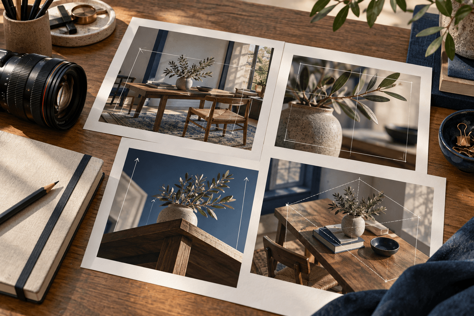
A prompt can describe the right subject and still produce the wrong picture because the frame has not been directed. Camera perspective tells the viewer where the image seems to be observed from, how much of the subject is included, and how foreground, middle ground, and background relate.
Words such as “cinematic,” “professional,” or “high-end” can influence mood, but they do not reliably specify a viewpoint. A stronger prompt makes the camera decision visible: a front-facing catalog view, a close three-quarter portrait, a low-angle architectural frame, or a wide environmental scene. This gives the image model a visual job instead of leaving the frame to guesswork.
1. Treat perspective as a visual decision
Start with the reason the image exists. A product page may need a readable silhouette and controlled proportions. A portrait may need an intimate relationship between face and environment. A travel scene may need a small subject that communicates scale. The right camera direction follows from that purpose.
Write a short sentence before writing the full prompt: “Show the object clearly from a slightly elevated three-quarter view.” That sentence identifies the camera relationship before style, palette, and atmosphere begin to compete for attention.
Perspective also affects what the viewer believes about the subject. A low viewpoint can make a structure feel imposing. A close view can make material texture feel important. A distant view can turn a person, vehicle, or building into a scale cue. None of these is automatically better; each serves a different visual problem.
2. Name the viewpoint clearly
Viewpoint describes the relationship between the camera and the subject. Use plain spatial language before adding technical vocabulary:
- Front-facing: useful when the face, label area, silhouette, or front plane must remain clear.
- Three-quarter view: reveals front and side planes while preserving a strong hero shape.
- Side profile: emphasizes outline, movement, or a layered relationship between subject and setting.
- Top-down: organizes a tabletop, layout, collection, or flat arrangement.
- Low angle: gives height and presence, especially to architecture or a standing subject.
- Eye level: creates a neutral, human-scale relationship with a room or person.
Do not stack contradictory directions. “Front-facing side profile” asks the model to reconcile two different relationships. If a hybrid view is intended, describe what should be visible: “a three-quarter view with the front plane dominant and one side edge readable.”
For a reusable prompt, make the camera direction a variable only when the rest of the composition can survive the change. A [VIEWPOINT] placeholder should have values such as “eye-level three-quarter view” or “slightly elevated tabletop view,” not a whole hidden scene.
3. Control distance and subject coverage
Viewpoint alone does not tell the model how much of the subject belongs in the frame. Add a coverage instruction: close-up, medium view, full-length frame, wide establishing view, or a specific amount of breathing room.
Coverage should protect the visual priority. A close portrait can preserve facial expression but may remove the setting that gives the image context. A wide room view can communicate layout but make small material details unreadable. A product close-up may reveal texture while losing the object’s full silhouette.
Useful pairings include:
- Close-up plus material priority: use when surface, texture, or facial expression carries the message.
- Medium view plus contextual setting: use when the subject and its environment must share the frame.
- Full-length plus readable gesture: use for fashion, portrait, or movement studies.
- Wide view plus scale cue: use for travel, landscape, interiors, and concept art.
Avoid relying on “zoom” as the only instruction. State what should remain visible and what can fall away. “A medium three-quarter view with the entire product silhouette visible and quiet space around it” is more useful than “zoom out a little.”
4. Build depth without distortion
Perspective works with depth. Foreground objects, a middle-ground subject, and a quieter background can create spatial hierarchy, but too many layers can compete with the hero. Decide which plane carries the visual information and which planes support it.
Lens language can help, but it should not replace a clear composition. A wide-angle direction may communicate a room or landscape, while a longer-lens feel can compress distance and reduce background distraction. The exact optical result varies by image model, so describe the visible effect as well: “a wide environmental view with believable room edges” or “a compressed portrait background that keeps the face dominant.”
Watch for distortion around the frame. Wide perspectives can stretch people, furniture, products, and architecture near the edges. For a precision-sensitive subject, keep the hero near the central composition and request natural proportions. For an expressive environment, some spatial exaggeration may be acceptable, but it should be an intentional trade-off.
Lighting supports depth as well. A grounded shadow, controlled edge separation, or a clear window direction can help the subject sit in space. If light is described only as “dramatic,” the model may add contrast without improving spatial readability.
5. Combine perspective with the use case
Camera direction is strongest when it agrees with the intended placement. A square marketplace image may need a centered product view with enough margin for a crop. A vertical social visual may use a low-angle hero that reads quickly on a small screen. A poster concept may reserve an asymmetric area for later copy. A wide article feature may need a scene that remains legible when reduced.
Connect the camera decision to the output ratio early. The aspect-ratio planning guide explains why a frame should be chosen before generation rather than treated as an export setting. Perspective, subject coverage, and negative space all change when the canvas changes.
For product photography, protect the object first: identify the hero, specify its visible planes, and keep the viewpoint compatible with its geometry. For portraits, protect facial clarity, eyes, hands, and the intended gesture. For interiors, protect scale, lines, and a believable relationship between furniture and architecture.
Do not promise that camera language will force exact optical behavior. The prompt can establish a direction and a testable target, but the output still needs inspection.
6. Test the camera direction
Choose a final master prompt and test it across controlled configurations. Keep the camera instruction stable while changing a declared subject or setting. This helps reveal whether the prompt protects its perspective or only happened to work for one scene.
A practical four-image test might use the same three-quarter product direction across ceramic, glass, metal, and paper subjects. Compare whether the visible planes remain readable, whether the hero stays dominant, and whether the surrounding space continues to support the use case.
Record observations in concrete language:
- “The three-quarter view remains readable, but reflective products need more controlled background contrast.”
- “The wide interior view communicates layout, although small hardware is not reliable at this distance.”
- “The low angle adds presence, but the lower frame needs a stronger crop instruction for mobile use.”
This is the same evidence-first approach described in the consistency testing guide. A real test does not require every result to be perfect. It should make the stable qualities and the failure boundaries easier to see.
7. Know the limits
AI image systems do not expose a single universal camera model. Terms such as focal length, sensor perspective, depth of field, and lens compression may be interpreted differently by different providers and model versions. Use them as supporting language, not as a guarantee of measurable optical accuracy.
Perspective-sensitive subjects can still fail: hands near the camera may distort, repeated architectural lines may bend, text on a sign may become unreadable, and product proportions may drift. Generated images are not technical drawings, architectural documentation, product certification, or proof of a real place.
Check likeness, consent, trademarks, logos, text, rights, safety, and commercial suitability before using an output. The AI Usage Policy and Disclaimer describe broader boundaries for generated visuals.
8. Use a final checklist
Before publishing or reusing a camera-focused prompt, check:
- The image has a defined visual job.
- The viewpoint is named in plain spatial language.
- Subject coverage and breathing room are explicit.
- Depth, background, and edge distortion are considered.
- The camera direction fits the aspect ratio and placement.
- Variables are visible rather than hidden inside a vague placeholder.
- Multiple demos use the same final master prompt.
- Limitations are stated honestly, especially for geometry, text, and technical accuracy.
The goal is not to imitate a camera manual. It is to make the frame intentional enough that another person can understand, adapt, and test it. A short prompt with a clear viewpoint and subject priority is usually stronger than a long prompt filled with unranked lens terms.
That is the approach behind the Prompt Harend library: original visual prompts, real demonstrations, practical guidance, and honest limits. Start with the visual problem, choose the frame that serves it, and let the camera direction support—not obscure—the subject.