

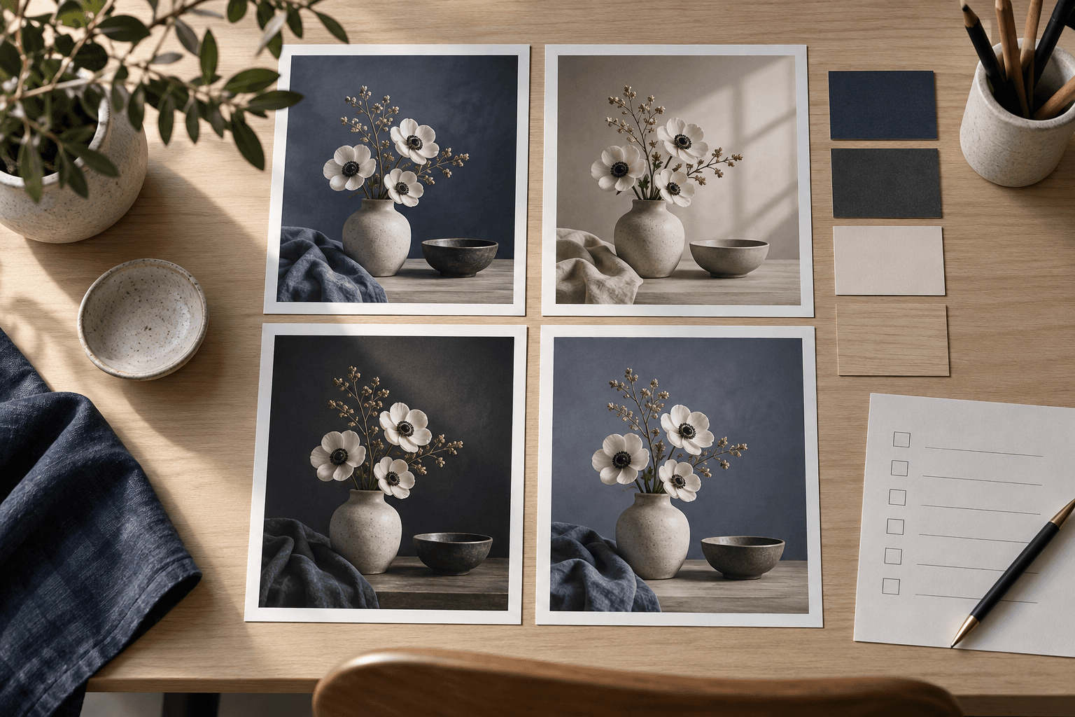
The same visual idea can feel intentional in one frame and awkward in another. A wide banner gives a landscape room to breathe, while a portrait frame can make a person or a tall object feel present. Aspect ratio changes what fits, where the eye lands, and which details must be left out.
For that reason, the ratio belongs in the brief before generation. It should be treated as part of the visual problem alongside subject, viewpoint, lighting, and use case. A model can produce an attractive image in an unsuitable frame, but a beautiful result that cannot be placed is not a finished solution.
1. What aspect ratio changes
Aspect ratio describes the relationship between width and height. A 1:1 square gives equal weight to both axes. A 3:2 landscape offers horizontal room for context. A 4:5 portrait preserves a strong vertical presence while remaining practical for many feeds. A 9:16 frame is tall and immersive, but it asks the composition to work within a narrow central corridor.
The ratio affects at least four things:
- Subject scale: how large the hero object or person can appear without being cropped.
- Negative space: where breathing room can sit around the subject and where copy might later be added.
- Context: how much environment can support the story without becoming the story.
- Visual rhythm: whether the eye travels across, down, or toward a central focal point.
Changing the ratio after generation is sometimes useful, but it is not neutral. A crop can remove a hand, shadow, architectural edge, product handle, or intended direction of gaze. When the frame is important, compose for it from the beginning.
2. Choose by placement, not habit
Start with the place the image will be used. An editorial article header may need a wide composition with a quiet side for the headline. A portrait card may need 4:5 so the face or full object survives at a useful scale. A square can make a collection feel orderly, while a tall social frame may prioritize gesture and vertical movement.
Ask what the image must do in its final context:
- Where will it appear, and how much of it will be visible before scrolling?
- Will text, buttons, or interface controls occupy part of the frame?
- Does the subject need full-body, full-object, or environmental context?
- Will the image sit beside other images with a fixed shape?
If you do not know the final placement yet, choose a ratio that protects the primary subject and record the uncertainty. Do not promise that one generation will work equally well as a hero banner, thumbnail, poster, and mobile story. Those placements have different compositional needs.
3. Protect the subject first
Before adding style, decide what cannot be lost. For a portrait, it may be facial clarity and the relationship between eyes, hands, and frame. For a product, it may be the silhouette, controls, seams, handle, or material transition. For a room, it may be the doorway, horizon, or path that explains the spatial idea.
Then describe the frame in relation to that priority. “A full product view with controlled space on both sides” is more useful than simply naming a wide ratio. “A vertical portrait with the face in the upper third and enough room below for the gesture” gives the image a job to do.
Negative space should be deliberate. It is not empty because the model ran out of ideas; it is a place for hierarchy, breathing room, or later editorial use. If the subject fills every edge, a crop may feel dramatic, but it will be less adaptable.
4. Write the ratio into the prompt
State the aspect ratio near the output intent, but connect it to composition. A useful instruction might say: “Create a 3:2 landscape editorial still life, keep the object fully readable, and leave calm negative space on the left.” The ratio, subject protection, and placement are working together.
Do not rely on a ratio token alone to solve the frame. “4:5” cannot tell the model whether the subject should be centered, full-length, or cropped at the shoulders. Add a viewpoint, camera distance, and visual priority that agree with the shape.
Keep ratio-specific instructions separate from variables when possible. The stable prompt can protect the composition, while [SUBJECT], [SETTING], and [PALETTE] change between demos. This makes it easier to see whether a failure came from the frame, the subject, or the environment.
5. Test the crop honestly
Generate several variations from the same final master prompt and inspect them at the intended display size. Look for repeated evidence: does the subject stay intact, does the focal point remain clear, and does the empty space remain useful? A ratio that works once may fail as soon as the setting or subject changes.
Test more than the thumbnail. Small previews hide cropped fingers, merged edges, unreadable controls, and awkward transitions near the boundary. If an image may be used commercially, also inspect logos, typography, likeness, rights, and product claims separately from composition.
When a ratio consistently causes failure, change the ratio or rewrite the composition instead of piling on adjectives. A tall frame may need a closer viewpoint; a wide frame may need a stronger horizontal relationship between foreground and background. Record that limitation so users do not mistake a tested range for a guarantee.
6. A final checklist
Before publishing an image prompt, check:
- The ratio matches a named placement or use case.
- The subject’s non-negotiable details are explicit.
- Camera distance and viewpoint agree with the frame.
- Negative space has a purpose.
- Multiple variations were tested from the same final prompt.
- The demo set shows meaningful limitations, not only the strongest crop.
- Rights, likeness, logos, and commercial suitability remain the user’s responsibility.
Aspect ratio is a small line in a prompt, but it carries a large amount of visual intent. Choosing it early helps the model solve the right problem and helps the person using the result understand what the image was designed to do. For more prompt structure, read the prompting framework and browse the Prompt Harend library.