

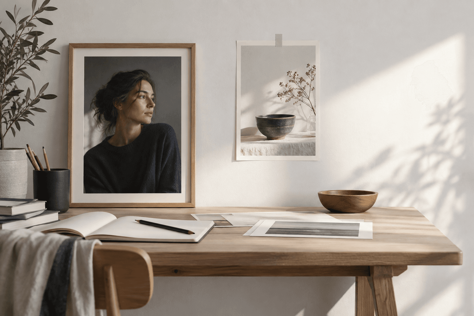
Negative space is not a missing subject or a blank corner left by accident. It is the area around the subject that helps the viewer understand priority, scale, direction, and possible use. In an AI image prompt, asking for that space can be as important as describing the object itself.
A portrait may need calm space beside a face for a headline. A product may need breathing room so its silhouette does not merge with the background. An editorial still life may need a quiet surface that lets one material or gesture carry the story. The open area has a job, even when it contains very little.
1. What negative space means
Negative space is the visual field that surrounds or separates the primary subject. It can be a plain wall, a soft shadow, a patch of sky, a quiet tabletop, or an intentionally simplified background. It does not have to be empty in a literal sense; it has to be less visually demanding than the subject.
Good negative space creates contrast in attention. If every part of the frame carries equal detail, the viewer has to work too hard to find the point. If the space is too empty without a reason, the image can feel unfinished. The goal is a relationship between focus and rest.
Describe the role of the space rather than only its color. “Leave calm room on the left for editorial copy” communicates intent. “A large beige background” describes a surface but not how the composition should use it.
2. Give the open area a purpose
Start by deciding what the open area should support:
- Editorial space: a quieter region where a title or caption might sit.
- Directional space: room in front of a person, vehicle, or object that suggests movement or gaze.
- Scale: an uncluttered environment that makes the main subject feel small, monumental, or isolated.
- Separation: a clean interval between a product and its background so edges and materials stay readable.
- Rhythm: a pause that balances a dense cluster of detail elsewhere in the frame.
Choose one primary purpose. A single area can support several effects, but a prompt becomes harder to interpret when it asks the same space to be dramatic, minimal, richly detailed, and full of information at once.
3. Place the subject deliberately
Use placement language that relates the subject to the frame: “subject on the right third,” “portrait aligned slightly left of center,” “product anchored low with open space above,” or “full-length figure with room in the direction of movement.” These instructions give the model a compositional relationship instead of leaving the subject to default centering.
Placement should agree with the subject’s action. A person looking left usually benefits from room in front of the gaze, while a product with a handle or opening may need space on the side that explains its function. The correct choice depends on the visual story, not a universal grid rule.
Be careful with edge proximity. A subject near the border can feel intentional when the crop is part of the idea, but it can also lose important details. State whether the subject should remain fully visible, gently cropped, or allowed to approach the edge.
4. Write space into the prompt
Place the negative-space instruction alongside composition and output intent. For example: “Create a 3:2 editorial portrait, keep the face clear on the right side, and leave a calm, low-detail wall on the left for copy.” This connects frame, subject, and use case.
Use concrete visual qualities: low-detail, uncluttered, quiet, softly graded, open, or unobstructed. Avoid relying on “minimal” alone; the word can mean simple styling, few objects, broad lighting, or an abstract mood. Explain what should not compete with the subject.
Negative space can also be a variable. Keep the stable prompt instruction—protect the face, product, or gesture—then change whether the open area is a wall, tabletop, sky, or fabric backdrop. This turns composition into something that can be tested instead of a single lucky arrangement.
5. Test the balance
Generate several variations from the same final master prompt and check whether the space remains useful. Does it stay quiet, or do props and artifacts fill it? Does the subject remain readable, or does the empty area make it look accidentally off-center? Does the intended copy area have enough contrast for the actual placement?
Review at the size where the image will be used. A background that appears calm in a large preview may become visually busy in a small card. Conversely, a composition that looks sparse on a large canvas may have the right balance once the image sits beside text.
If the subject keeps drifting toward the center, strengthen the relationship: specify the side, the amount of breathing room, and what the open area should contain. If the space is too large, define a stronger subject scale or a secondary quiet surface without adding competing objects.
6. A final checklist
- The open area has a clear purpose.
- The subject’s position relates to gaze, movement, function, or copy.
- The background is quiet without becoming meaningless.
- The aspect ratio supports the intended space.
- Several variations were tested from the same final prompt.
- The demo images show the range honestly, including drift or clutter.
- Rights, likeness, logos, and final editorial decisions remain the user’s responsibility.
Negative space is one of the simplest ways to make a generated image more usable. It gives the subject room to be understood and gives the final layout room to breathe. For the larger prompt structure, read How to Write Better AI Image Prompts and browse the Prompt Harend library.